Pixel-Perfect Mac + Plastique
Apple provide detailed specifications of how Mac OS X applications should look and behave. One aspect of these specifications is the spacing that should be used between widgets on a form. For aesthetic reasons, Apple requires different values to be used for different widgets. Starting with Qt 4.3, the layout and style systems talk together to take this into account, rather than using a middle-of-the-road value. The result? Dialogs that look perfect on the Mac. Having just seen the light, we rushed to try out the same with Plastique, the default X11 style.
- The Aqua Guidelines
- Variable Margins and Spacings
- The Layout Item Rectangle
- Other Visual Improvements for Mac OS X
- Conclusion
The Aqua Guidelines
One of Mac OS X's most noticeable improvements over previous versions of the operating system is the introduction of a new look and feel, dubbed Aqua. The Aqua look takes advantage of the Mac graphics hardware, using semi-transparency and non-linear transformations to provide smooth visual effects. Built-in components of Mac OS X such as the Dock and the window frames, applications like Finder and Safari, and low-level libraries such as Cocoa and Carbon all contribute to defining the Aqua look.
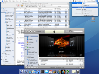
Figure 1. A Mac OS X 10.5 desktop featuring Aqua
Mac developers who use Cocoa or Carbon directly get Aqua-themed widgets for free. The same is true of Qt developers: QMacStyle, the class that draws widgets on the Mac, uses the HIThemes API, just as Carbon itself does, ensuring that QPushButton, QScrollBar, and all their friends look native on the Mac.
However, parts of what makes an application look "Aqua" needs to be handled by the programmer. The Apple Human Interface Guidelines, sometimes called the "Aqua guidelines", is a freely available document intended for "anyone building applications for Mac OS X", to ensure that their applications will blend in well with other Mac applications.
One of the aspects that falls under the guidelines is the size of graphical components and the recommended spacing between these components. For example, the guidelines specify that normal-sized push buttons should be 68 ? 20 pixels and that the spacing between buttons laid out horizontally or vertically should be 12 pixels. In contrast, there should be 8 pixels between vertically stacked checkboxes, and 5 pixels between radio buttons.
Using Qt 4.2 or earlier, the only way to respect the inter-widget spacing constraints was to lay out forms manually, either in Qt Designer or in code. QMacStyle reported correct size hints for widgets, but the built-in layout managers (QBoxLayout and QGridLayout) worked in terms of fixed-size margins and spacings.
![]()
Figure 2. Examples of Aqua pixel metrics
A similar issue arises with margins: Until Qt 4.3, the layout used the same margin on all four sides of a window, while the Aqua guidelines specify 14 pixels for the top margin and 20 pixels for the left, right, and bottom margins.
While these constraints may seem arbitrary, most of them actually make sense. For example, the top margin is smaller than the other three margins to account for the visual impact of the title bar. Likewise, mutually exclusive radio buttons rightfully deserve to be shown more closely together than checkboxes controlling independent settings.
 |
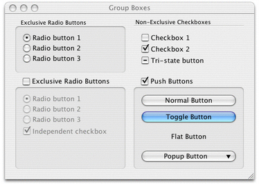 |
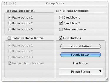
| Figure 3. Incorrect Aqua margins and spacings (Qt 4.2) | Figure 4. Correct Aqua margins and spacings (Qt 4.3) |
Figures 3 and 4 show the same dialog taken with Qt 4.2 and Qt 4.3. In the Qt 4.2 version, which uses 11 pixels for the margin and 6 pixels for the spacing, the dialog's top margin is too large, and the left, right, and bottom margins are too small. There is also a bit too much space between radio buttons, checkboxes, and push buttons, but, at the same time, too little space between the bottom two group boxes. (If you look closely at Figure 3, you might notice that the effective spacing of the push buttons is much more than 6 pixels; this is because QPushButton has a margin onto which it normally doesn't draw.)
In contrast, the Qt 4.3 version version of the dialog follows the Aqua guidelines. The result is much more visually appealing, and integrates nicely with other Mac OS X applications.
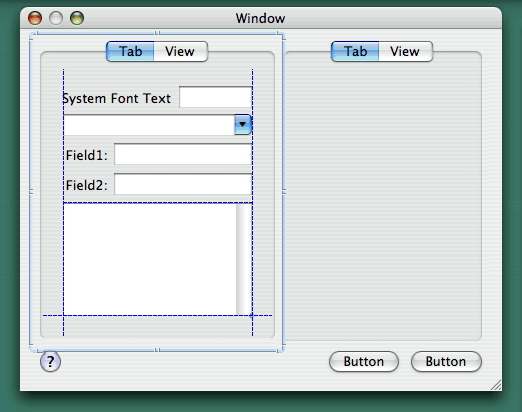
Figure 5. Apple's Interface Builder in action
Mac developers who develop their applications directly on top of Cocoa or Carbon keep their sanity by using Interface Builder, a GUI design tool provided by Apple. While Interface Builder falls short of offering a high-level layout system, it displays visual hints, or "guide lines", making it easy to line up widgets and to use appropriate margins and spacings around and between them.
Variable Margins and Spacings
To obtain correct margins and spacings with Qt, all that is necessary is to recompile our existing applications against Qt/Mac 4.3. The margins and spacings are transparently handled by Qt's layout and style systems. More precisely, QBoxLayout and QGridLayout now query the active QStyle to obtain proper margins and spacings, based on the widgets that are in the layout—and QMacStyle now provides that information.
Unsurprisingly, many changes were necessary in Qt to make this happen. First, the old QLayout::setMargin(int) function had to be generalized to take four arguments. The new function is called setContentsMargins(), because its signature and semantics follow that of QWidget::setContentsMargins(). Like before, the default values come from the currently active style; for QMacStyle, the default values are 20, 14, 20, 20.
To provide different spacings between different types of widgets, we had to extend QSizePolicy so that it reports a ControlType. By default, QPushButton reports PushButton, and QScrollBar reports Slider, and so on. The layout managers query these values and pass these on to the style. To obtain the horizontal space between two QCheckBoxes, the layout manager would call
    int spacing = style->layoutSpacing(QSizePolicy::CheckBox,
                                       QSizePolicy::CheckBox,
                                       Qt::Horizontal);
Figure 6 lists the different spacings used by QMacStyle in Qt 4.3. The values were based partly on the Aqua guidelines, partly on Interface Builder (whose values often contradict the Aqua guidelines), and partly on common sense.
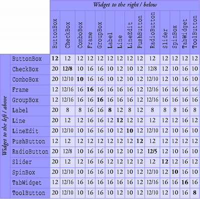
Figure 6. Spacings used by the Mac style in Qt 4.3
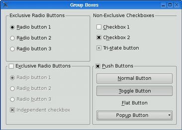
With this mechanism in place, we decided to also provide variable spacings in QPlastiqueStyle, the fallback style on X11. Figures 7 and 8 below show the same dialog taken with Qt 4.2 and Qt 4.3, using Plastique style.
 |
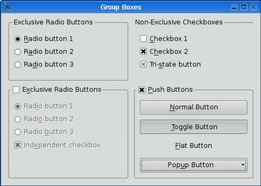 |
| Figure 7. Fixed-size spacings with Plastique (Qt 4.2) | Figure 8. Variable spacings with Plastique (Qt 4.3) |
To obtain the Qt 4.2 behavior, we can call setSpacing(6) on the layout to specify a fixed spacing.
The Layout Item Rectangle
Child widgets cannot draw outside their geometries. Historically, this was necessary because the window system did not allow this, but in more recent versions of Qt this is preserved mainly for historical reasons.
So why would a widget want to draw outside of the rectangle (0, 0, width() - 1, height() - 1)? The main reason is to draw a focus rectangle, a shadow, or some protruding elements. When we put a widget in a layout, we would like these elements to overlap the margin around the widget.
In the Graphics View framework, QGraphicsItem has a clipping rectangle, boundingRect(), that defines the area into which it may draw, and an arbitrary non-rectangular geometry, shape(), that is used for mouse hit tests. Focus rectangles, shadows, and drag handles can be drawn outside the geometry defined by shape() by specifying a suitably large boundingRect().
Ideally, QWidget would work like QGraphicsItem: It would be equipped with a boundingRect(), which could be different than rect(). However, this change would affect lots of existing code in Qt and in applications, so it was rejected for Qt 4.3.
Instead, we decided to keep the equation "geometry == clipping rectangle" in place and to introduce an implicit "layout item rectangle", which specifies the actual geometry of the item, excluding any shadow or other extra. This rectangle is defined by the active style (as SE_CheckBoxLayoutItem, SE_ComboBoxLayoutItem, etc.) and queried by the built-in layout managers. (To opt out, we can set the Qt::WA_LayoutUsesWidgetRect attribute on a widget.)
For all styles except QMacStyle, the layout item rectangle of a widget is always (0, 0, width() - 1, height() - 1). For Mac, the appropriate values were derived from Interface Builder, which has a mode where it shows the layout item rectangles as red boxes, as shown in Figure 9.
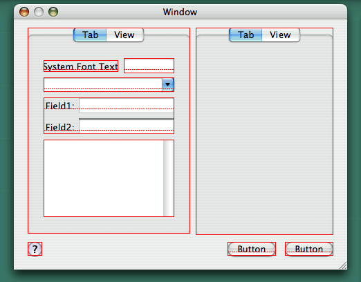
Figure 9. Layout item rectangles in Interface Builder
In addition to layout item rectangles, Interface Builder also shows the baselines of widgets that display one line of text (such as labels, line editors, and push buttons). When laying out widgets side by side, the baselines should be aligned. Qt 4.3 doesn't provide explicit support for this, but we hope to address this in future Qt versions.
Other Visual Improvements for Mac OS X
Qt 4.3 brings some other good news to Qt/Mac developers---and ultimately to Mac end-users: Support for Mac-style "unified toolbars" has been added as an option to QMainWindow, the Mac-compliant Wizard Qt Solution has now migrated into Qt as QWizard, and the application icon can be made to bounce in the dock by calling QApplication::alert().

Figure 10. Mac-style unified toolbar
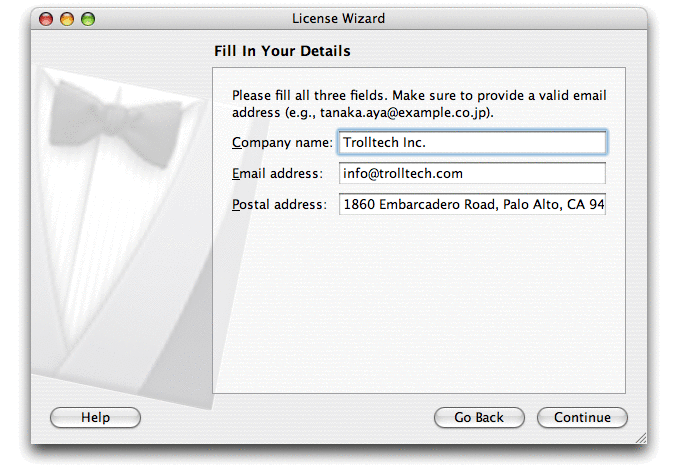
Figure 11. Wizard ("assistant")
These additons come on top of the Qt 4.2 improvements: The introduction of QDialogButtonBox, which reorders dialog buttons on the Mac, and the redesign of QMessageBox. These features were mentioned in the article Reordering OK and Cancel in Qt Quarterly issue 19.

Figure 12. Message box ("alert")
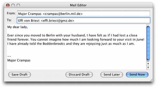
Figure 13. Dialog using button box
Conclusion
Qt's philosophy is that the toolkit should insulate the developer from the underlying platform. Whereas hard-core Mac developers who use Carbon or Cocoa must respect various pixel guidelines when designing dialogs (the Interface Builder "guide lines" sure help when they don't contradict the Aqua guidelines), Qt's layout and style systems take care of everything behind the scenes.
The current work is one step towards making Qt's layout managers and styles look better, on Mac OS X and elsewhere. In future releases, we hope to provide better support for baseline alignment in layouts and for high-resolution displays.
